If you start by searching for Zarget on Google, you’ll get part of an answer:
“Zarget is website optimisation software which provides Heatmaps, A/B Testing, Split URL Testing, Funnels Analysis and form Analytics for businesses to….”
OK, so that leaves us a little more informed, as does the title of the entry, which refers to Zarget as Conversion Rate Optimisation (CRO) software.
So, let’s walk away from the Acronyms, and look at why YOU will want to use Zarget to help your business.
Many modern sellers don’t just sell on marketplaces, like Amazon or eBay. You probably already have your own eCommerce website, with greater control over costs, meaning you can offer more attractive prices. But I’m guessing your marketing spend and team don’t even approach those of the big marketplaces. Therefore, once you get someone on your site, you want to make sure they stay, and they buy. There’s a lot of things that affect this decision – Getting them there is only half the battle!
The advantage to owning and controlling the site is your ability to change it to suit your needs and those of your customers. You can add special functions, unusual payment methods, gift pickers… Or you can have a very stark look that is all about the products, with ‘very few fiddly bits’. Or you could be somewhere in between.
But the customers may not like what you like – This is an important lesson.
How can you tell, in a reliable manner, what people are looking for? You need information like this to guide your changes. If you put a survey up, the sample is skewed because more people will fill it out that didn’t like it, or are having a bad day – It’s human nature to vent frustration, reasonable or otherwise. And once you make changes, how do you know what works, and what doesn’t?
Zarget is a set of integrated software tools with the purpose of helping you to optimise and improve your website.
That sounds simple.
Far from it. You still have a lot of work ahead! But that work will be based on data, as much as your feelings and experience.
Firstly, let’s be honest – There are lots of tools out there that will claim to help you to see what is happening on your website so you can make it better. Some are even free. There are lots of people who will be happy, for a fee, to tell you what your site does wrong, and how it can be improved.
But each tool only does a single thing, and so you end up with a lot of different sets of results and reports, which you may not entirely understand alone, let alone combined with each other.
Or your report is great, well written, with lots of charts, but the conclusions and recommendations don’t match your business objectives (or budget). And the consultant who wrote the report won’t help you implement the recommendations.
So why should I try Zarget?
Zarget isn’t here to tell you what you’re doing wrong. It’s here to help you understand what people do when they visit your website, and how they are using it. It will help you see what does and doesn’t work for your customers, and helps you to try alternatives, while keeping track of the outcomes. What you do after that is up to you, but you will know more about what works, and what doesn’t/ You will know if your actions have changed the way people interact with your website and buy from you.
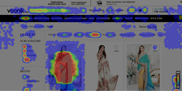
Heatmaps show you, page by page, who clicks where. Hot spots are controls that some people use lots, or lots of people use. Cold spots are areas or features no one bothers with, so you might want to consider losing them and focusing on what’s hot and works. Zarget knows who did what, so it knows the difference between one person clicking on the same link 20 times, or 10 people clicking on it twice.
Scrollmaps are similar to Heatmaps, but they help you to see if people scroll down your page “below the fold”. It also shows you where they linger. Maybe you can ‘tighten up’ the front page and focus on what people are spending time and attention on. By optimising it, more people will be likely to not just stay on your site, but dig deeper and purchase.
So – you know where people are clicking and scrolling, and can compare that to the model in your head. But you still need to make a coordinated plan to use this information to improve the experience of visitors to the site.
The ‘customer journey’refers to the path customers should follow when they come to your website. Clicking on a link to your home page in an ad, clicking on the search box, or the special offers page – Maybe a category page, then drilling down to a product and adding it to their basket.
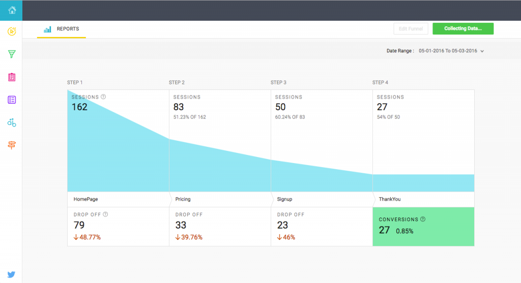
Zarget lets you assign your site’s pages to different ‘stages’ of the journey you expect them to follow. At this point, the journey turns into a Funnel – It starts with many, but they slowly drop away until the core audience come out of the other end to buy from you. You expect some people to drop off along the way as they change their minds or get distracted. But you want to keep as many people as possible all the way to the end of the funnel, the point at which they convert from a visitor to a customer, and click on the checkout. Zarget shows you how people make their way through the funnel, where they started and finished, and how many.
Once you know where people are leaving, you can analyse the page, improve it, and lose less visitors. Or review their journey to that final page, looking for places to fine tune it and improve their choices. Heatmaps and scroll maps can help here. And what you learn informs your decisions on the website updates or changes you make later, saving time.
What about the difficult people, those who don’t follow the funnel? Zarget lets you drag and drop the stages, or remove them all together, and show you the customers who followed that route – So you can find out where they went wrong, and adjust. No one likes to lose a member of their flock!
Do you use Forms on your website? I know this may not apply to all of you, but if you have a ‘Contact Us’ page, and people complain about how hard it is to talk to you, or get customer service, why not look at how people act on the form – How they use it. Zarget can help you see which order they fill in the fields, where they stop, or even which fields they change. Maybe you can pare down your form, change the labels, or use a different field altogether?
You don’t just want the visitors to buy once – You want to form a bond with them, so they’ll keep coming back for more. Forms are used for a range of contact options, and even for filling in your details at the checkout. Best make sure you’re not losing people just as they get their card out!
The next arrow in Zarget’s quiver is its Polls & Feedback tools. With these, you can create a popup question or questionnaire for visitors to your site. It can be simple or complex, letting you learn why they visit you, how they use the site and many other things – and little details add up!
A questionnaire can branch into multiple routes, so the answers you get back about your site and its content can have a surprising amount of depth. This can give you valuable feedback, to help reinforce all the other information you already have.
The Winds of Change
Now that you know what people are doing on your website, and why they are doing it, you can decide on changes you’d like to make to improve their experience. But don’t rush!
The next 2 features of Zarget mean that you can have your cake AND eat it:
A/B Testing and Split Testing
These features are designed to allow you to try changes, without committing to release them to the whole world.
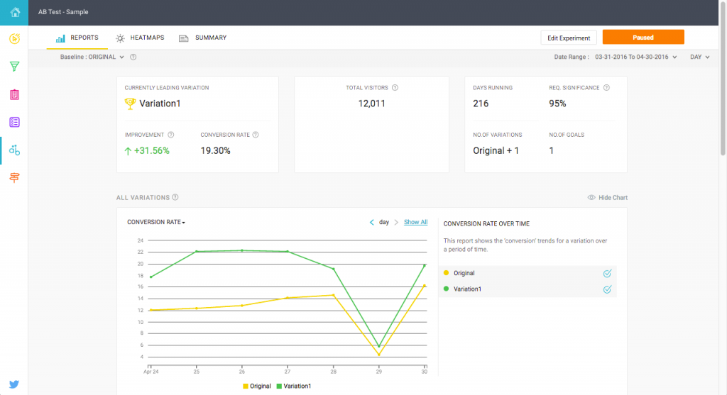
A/B Testing – With A/B testing, you can use Zarget’s powerful tools to make multiple copies of one page, and change something about each. You can then tell Zarget, by percentages, how many of your visitors you want to see which layout, or specify rules for WHICH users will see them. You can then go back and review the results for each layout, to see which changes got increases and decreases over and above the original, default page. You can also see which page(s) were more popular with mobile users (Well worth paying attention to!)
Split Testing – While A/B testing is all about edits to the same page on the server, Split Testing uses multiple pages to achieve the same effect. People are sorted into different groups (defined by you), and shown different pages. Their reactions and journeys are recorded, for later analysis, allowing you to select the most successful ones and learn from them.
Lastly, and still in Beta, is the most important feature – Replays!!!
With the Replay functionality, you no longer have to wonder what people do between clicks. The Replay functionality is available to anyone using the rest of Zarget’s features – Nothing else needs to be done!
You’ll be able to view exactly what your customers did on the site, from scrolling, selecting links, entering fields into forms, moving from page to page. It’s a revelation, a window into the customer’s behaviour and thought processes. All at your fingertips – Just remember to NOT record the final part of their checkout.
With Zarget, you don’t need to wonder what does and doesn’t work on your site. You can see what people are doing and looking at, and know. You can then tweak, experiment and improve to your hearts’ content. And if someone asks why you did something, why not show them?
With Zarget available, I firmly believe your web shop is in safe hands – Yours! Zarget just helps you to make decisions with better information and less trial and error (and less wasted money). What isn’t to like?


