If you are selling online, especially if you have an eCommerce website, then you might have heard the terms UI and UX (User Interface and User eXperience). They apply equally to the physical world as much as the digital, but we’re worried about the digital here. The question is:
What are UI and UX? And why do I need to worry about them?
UX – User Experience Design is about the way people move through your website or store. It’s about offering good, clear choices, so people can achieve their objectives quickly, (for example, making their purchase) and without confusion. If the customer has to stop and look too hard, they might be tempted to go elsewhere, and that’s a potentially lost sale.
Specialists in UX use research and experience to make the structure of your website, and the choices it offers customers, as clear and simple as possible. When UX designers do their jobs right, you have a massive reduction in the number of people complaining that “it’s not the colour they wanted”, or “I couldn’t find what I wanted, so I went to Amazon”.
You might have heard people talk about a ‘Funnel’, or the ‘customer journey’, which is the way your customers should move through your website from first view to actually making a purchase. UX designers are the people that make it happen. If a customer doesn’t understand the choices, they can get confused and give up. If everything is clear and they feel comfortable, then they will be more likely not just to buy what they came for, but to look for other items or take suggestions. This will increase the average size of baskets.
UX Designers recommend revisiting things periodically to see what has changed with your business, and your audience. You can then optimise your UX to ensure your customers continue to get a great experience, meaning you stay busy with loyal and happy customers.
UI – User Interface Design is about the appearance of the site, how pleasing it is to the user/customer, and how well it represents your brand. UI Designers take the work that the UX Designers have done, and combine it with your brand image, so the site is easily identifiable as yours. Your website needs to be pleasing to the eyes of the customer, so that they will stay on the site and use all of the UX designer’s hard work, without making it more decorative than useful. They can highlight and enhance the work of a UX designer, and work with your developers to make sure that the site itself responds to the user and doesn’t make them wait for pages to load, etc.
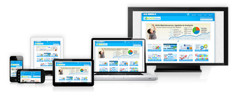
UI Designers are also concerned with making sure your site looks great on all devices – Tablet, Smartphone, Apple devices, Smart TV – wherever, no matter the size and resolution of the screen. Once again, if it doesn’t look good at the time of the visit, and your customer can’t see the choices clearly, then they won’t stay on your site, let alone buy from you!
So, why do you need UI and UX when designing your website or web store?
Let’s look at how UX and UI alone and together can impact your customer’s experience of your website, and the returns you get on your advertising to bring new customers in.
UI over UX
The most common option is a site which looks great at first – Nice bright, well-coordinated colours, big pictures, animations that draw the eye without being irritating, and text that is visible – Evidence that the UI designer has done their job well.
Now, as a visitor, when you come to the site, and you’ve appreciated how pretty it is, you go to find the item you came to buy, let’s say a new shirt, and so you try to find where the shirts are. You scroll down past the initial images, reading the text about their great products and learning about all the reasons you came here to spend your money, looking for a menu, or some indication of categories. You reach the bottom of the page and find ‘Contact Us’, ‘Terms and Conditions’, ‘About Us’, but there’s no sign of a way to find what you’re looking for. You have 2 options now – You keep looking, or you go elsewhere, maybe to Amazon or Boohoo. Most people choose to go elsewhere at this point.
If you persevere, then you would find that some of the images you scrolled past in the text have actually got labels for types of clothes (Trousers, Shirts, etc) and act as links… But there’s very little to make them stand out. At this stage the site has lost a lot of potential customers because the site looks great, but it’s not been designed for a great User Experience. You gain at the first hurdle, as it’s an attractive site and people don’t click elsewhere. But you lose once they try to go deeper and buy something.
Similarly, if the site has got better navigation at first, but the sub-categories aren’t great, or the shipping options are hard to figure out, customers might stay on the website longer, but still leave before they spend money – The User Experience is what is letting them down.
UX over UI
If, on the other hand you go to a site which is quite plain, with colours that don’t match the brand, and simply laid out, then some might choose to go elsewhere, as they don’t feel like it’s attracting them, drawing their attention. That same site might make it incredibly easy to choose an item, size and colour that suits you and your budget, and pick the right shipping option to not break the bank, while getting your purchase to you as soon as possible. That has a great user experience, with all the options placed so people can find what they need, without beautiful design and layout, but it’s a lack of User Interface that loses you customers at the initial click, because it’s too plain or ugly, and we’re used to beautiful sites that grab our attention and stop us getting distracted.
Similarly, if the website is not usable on most mobile devices because it was developed on a large screen PC and wasn’t tested on smaller screens or designed to be adaptable to those devices, then in the modern world you’re losing more than half of your potential customers – The people sat on the train, at a bar, or waiting for their takeaway and getting in some opportunistic shopping.
Conclusion
Ideally, we want a good balance – An attractive, well laid out, and easy to use website so that people want to stay, want to come back, and have no problems finding what they want and buying it from you. This will help our businesses to grow. It’s worth taking the extra time to ensure your website is done right the first time – Or perhaps it is time to consider if your site could benefit from some re-evaluation, to help you to get the most from your investment by being available and easy to use to as many potential customers as possible.
We’re big believers here at eBG about doing it right the first time, and helping you – and your customers –to get the most from your website. We also know that the right answer today may not be the right answer next year, as your business, your customers, and eCommerce continues to grow and evolve. We work with you not just through the design and development, but afterwards, too.
UI and UX aren’t just fancy words to help part you from your money – They are absolutely vital components in making sure everyone gets the most from your site, and it’s a pleasant experience for your customers to buy from you. If you’re not sure that you are getting the best from your website, or you just want to make sure your first website ticks the right boxes, why not call us today on +44 0208 090 4547, or email us at [email protected]?


