Consumer psychology has contributed to the growth of retail sales for years, with the first studies to understand why and how people buy emerging as far back as the 1940s. As eCommerce has grown, so has research into how, and what makes people buy online. As eCommerce becomes ever more competitive, understanding the psychology of buying is ever more important to stay relevant and ahead of your competitors.
We’ll be taking a look at some of the elements of consumer psychology over the coming weeks and months, so you can make the most of your sales opportunities without having to read complicated research. To start, here’s five basic points you can consider for improving your sales from your website.
Impulse Purchases
 Websites like Groupon and Wish make so many sales because they capitalise on the impulse purchase – think about bored commuters, delayed on their way home, looking for a little pick-me-up treat to look forward to. Now, as each eCommerce business is different, we’re not saying you should definitely sell on those websites – although they can have their place, such as if you have dead stock to clear, for example – but rather that you can think about how you can increase impulse purchases with cross-sales and up-selling.
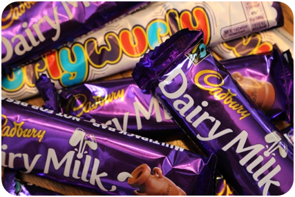
Think what appeals to an in-store shopper – promotions and sales. With online purchases, as the total amount a customer spends increases, they’re more likely to add an impulse purchase to their basket – like they do with point-of-sale displays in supermarket checkouts. We’ve all been tempted by the two-for-£1 chocolate bars at the checkout – it’s chocolate, after all, but the important thing is that there’s a deal to take advantage of, and it’s only £1 extra on the bill, and suddenly there’s two bars of Dairy Milk in our basket. (Even though if we went back to the confectionary aisle we could probably get more chocolate for the same price, it’s not worth the extra effort) See what we mean? That’s what you’re looking to replicate on your website. Think about Amazon’s “other people who bought this item also bought…” section.
Colour Psychology
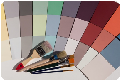
 We’re all aware of how colours have different connotations in the real world – red being ‘stop’, or implying danger, with green being ‘go’, for example. But there’s a wealth of useful information to be found when it comes to eCommerce, such as that blue hues imply high quality, trust, and generally increase custom, regardless of price, while the use of red makes customers more price sensitive because of the implied link with sales and discounts. Other examples of colour associations are orange with excitement and friendliness, but also low-costs (perhaps invoked by a certain Easy airline?) and black with power and intelligence.
All this said, colour psychology isn’t an exact science, and there’s not a one-size-fits-all solution – so make sure your colour scheme works with your brand.
More Information
This might be logical when you think about it,but more product information is almost always better. As customers ourselves, we’ve definitely walked away from making a purchase when there’s only been one image and minimal description, in favour of an alternative listing that provided better information. By providing more information, your customers are more likely to trust you as a seller, and clearly understand the product, leading to better customer satisfaction and fewer returns for you to deal with.
When buying online, customers simply can’t experience a product the way they would in store – they can’t feel textures or the quality of the materials, or smell it (such as in the case of leather handbags, or an aftershave, for example). On top of great product descriptions, that include important details such as laundry information, giving  your customers access to 360° views of your items, detailed zooming and the ability to switch between colours and prints or even videos of the product in action leads to your visitors having a much more positive view of your brand, which can increase purchases and repeat custom.
And rather than sharing how many are left, it’s been shown that displaying what you’re selling a lot of can increase your sales – by displaying ‘what’s trending’, your customers see what other people have been buying, which help to inspire those impulse purchases – they don’t want to miss out. After all, if so many other people have already bought it, it must be worthwhile.
Clear Categorisation
We’d recommend using subcategories to further segment your items – it gives the impression that there is more there by breaking it up into many smaller lists – and if you have lots to choose from, they’ll come back later after their initial purchase for another look. It also means that people will find what they are looking for easier, if they can go to a subcategory to sort through a smaller list than just starting at the top of a list of everything!
Optimise Your Layout
If your website has thumbnails of images in rectangular grids but you haven’t thought about them much past that, then you should – the layout is designed to replicate reading left to right, so you can help your customers find your most popular products by placing them on the left and in the centre of the page. If the bulk of your customers are from countries that read right to left, then think about switching this.
Ultimately, although your website might be your baby and you know how it works, using a mystery shopper who doesn’t know your website can help you identify where you can improve it. If you’re not sure where to start, get in touch with us – we’re happy to provide full website audits, giving you feedback on quick wins that you can implement to increase your sales, as well as long term recommendations for further success.